Start With the Window, Not the Promotion
Short-run campaigns often fail because the print job gets planned before the window has been measured. Every shopfront is different. Some have full glass panes right to the floor, others have transoms, frames, security bars or tiled surrounds that change where a decal can sit. A proper site survey helps you work out the usable glass area, the sightlines from the pavement and how much daylight you need to keep inside. That matters in central Bloemfontein where foot traffic changes by time of day and a darkened window can make a shop look closed.
We always look at what the window must do besides advertise. It may need to carry a sale message, show opening hours, give privacy to a back area, or shield stock from direct sun. Once those needs are clear, the format becomes easier to choose. A full vinyl wrap is not always the best answer. Sometimes a row of decals, a frosted band, or a seasonal banner is enough.
- Measure the visible glass, not just the frame size.
- Check where the sun hits during morning and late afternoon.
- Leave clear sightlines for staff and customers.
- Allow space for emergency exits, lock boxes and opening notices.
Choose Graphics That Sell Without Blocking the View
The safest shop window campaigns use a mix of solid print and open space. If every pane is covered, the shop feels smaller and the interior loses natural light. A better approach is to place the strongest message at eye level and use lighter coverage above or below. For example, a promotion line across the middle third of the window can carry the offer, while the upper section stays open for light and the lower section protects against kicks, scuffs and trolley marks.
For short-run work, removable vinyl is usually the easiest option. It can be cut to shape for logos, sale dates, arrows or product names. Printed film works well for images and pricing blocks, while frosted or etched-look film gives privacy without making the shop look shut. If the campaign needs to be seen from outside in bright daylight, colour contrast is important. White text on a dark field or dark text on a pale field reads better than busy layouts with too many colours.
- Use one main message and one support message, not five.
- Keep fonts large enough to read from the parking area or pavement.
- Use fewer colours when the window already has a busy interior.
- Ask for a test layout before print production if the campaign is time-sensitive.
Short-Run Printing Needs Fast Turnaround and Clean Removal
Retail promotions move quickly. School holidays, month-end sales, winter specials and stock clearances all come with fixed dates. That is why the process must be planned for fast print production and neat removal later. A campaign that goes up easily but leaves glue behind is more trouble than it is worth. The right adhesive and film thickness matter, especially on windows that get direct sun or strong coastal moisture after stock deliveries from the east coast. In Bloemfontein, dry heat and dust can also affect how long a surface stays clean before application.
Before any vinyl goes on, the glass should be cleaned properly and checked for old adhesive, chips or surface contamination. If there is an existing campaign, debranding or refurbishment may be needed first. That saves time on changeover day and helps the new graphics sit flat. We also make sure the edges are sealed where needed so the wind does not lift corners when the doors open and close through the day.
- Book removal and new application together to avoid downtime.
- Clean the glass with the right prep, not household residue.
- Choose film suited to sunlight and temperature swings.
- Plan for a clean take-down after the promotion ends.
Make the Campaign Work From the Street and From Inside
A shop window has two audiences. The first is the person passing outside, often in a hurry. The second is the staff and customers inside who still need to see out. If the graphics are too heavy, the inside feels closed off and the shop can lose that open, welcoming look. In some cases a two-stage design works best. The outside layer carries the sale message and the inside layer gives a softer brand finish or privacy band. That can be useful for consulting rooms, salons, agents, and any business that handles private conversations.
Think about the daily use of the window too. A campaign placed where trolleys, handbags or cleaning equipment pass can get scratched quickly. Lower sections may need tougher lamination or a simpler layout. For doors, the artwork must avoid handles, hinges and push plates. On floors, only the right slip-rated material should be used, especially if the entrance gets wet on rainy days. A good layout respects the way people actually move through the space.
- Protect busy contact points with tougher material or reposition the artwork.
- Use privacy only where it is needed, not across the whole pane.
- Keep door graphics clear of handles and safety markings.
- Match the design to how customers move, not just how it looks in a mock-up.
A Bloemfontein Example: Month-End Sale on a Busy Corner
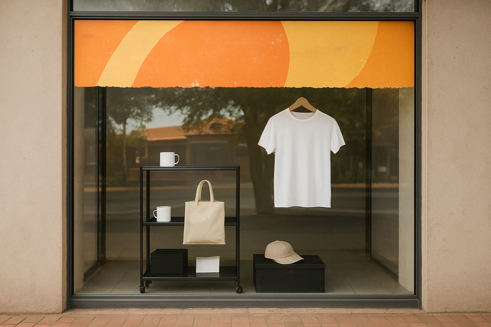
Take a clothing store in Hamilton, Bloemfontein, running a four-week month-end special. The owner wants the promotion visible from the street, but still wants passers-by to see the interior displays. The best solution is not a full cover. A practical setup would use a bold header strip across the upper middle of the glass, a smaller price panel near the entrance, and a frosted lower band to hide storage boxes and wiring. The front door gets a clear opening hours decal and a simple pull handle marker so the entrance stays easy to use.
If the campaign needs more impact, a temporary banner can be added above the shopfront, while the windows carry the core message. For a limited offer, that mix keeps the costs sensible and the changeover quick. It also means the next promotion can be swapped in without replacing everything. In Mangaung, Botshabelo, Thaba Nchu, Welkom or Kroonstad, the same principle applies: use the glass for the message, not every inch of it.
- Use one dominant headline, then let the product display do the rest.
- Keep the window easy to refresh for the next promotion.
- Combine decals with a banner only when extra visibility is needed.
- Choose a finish that still looks neat after dust and repeated cleaning.
From Artwork Setup to Maintenance Visits
Good window campaigns are built in stages. First comes artwork setup, where the layout is checked for size, spelling and line breaks. Then the logo redraws if the file quality is poor, followed by print production or vinyl cutting depending on the job. After that, the graphics are laminated if needed, fabricated where panels or mounts are required, and installed on site. This process sounds simple but it saves time and avoids expensive reprints when the shopfront dimensions do not match the original artwork.
Once the campaign is up, it still needs a little care. Dust, sun and repeated opening of doors can wear the edges down. A quick maintenance visit can sort lifting corners, replace a damaged section or remove old elements when the promotion ends. That is especially useful for businesses that run seasonal campaigns throughout the year. The aim is not just to put something on the glass, but to keep the frontage looking current and tidy.
For shops, offices and showrooms across Bloemfontein and the surrounding towns, the best window campaigns are the ones that sell clearly, protect visibility and change over without fuss. That balance is what makes a short-run promotion worth the effort.