
A practical graphics brief for residence living
The client was a student accommodation residence in Universitas, Bloemfontein, managing a steady flow of residents, visitors and maintenance staff. The main need was simple on the surface: make the spaces easier to read and harder to damage. In practice, that meant door numbers that stayed visible, notice panels that could be updated, and communal wall graphics that added identity without making corridors feel cluttered.
The residence wanted the look to be neat and professional, but not too formal. Student accommodation gets a lot of foot traffic, knocks from bags and trolley movement, and the occasional scuff from cleaners or furniture shifts. We planned the project around those daily realities and kept the finish clean, easy to maintain and suitable for indoor use in shared areas.
Because the work was for Bloemfontein, we also had to account for the dry Free State climate and the fact that some interiors can become dusty fast. That meant choosing materials that would stay flat, clean easily and not curl at the edges after a few months of use.
What had to work in shared student spaces
The residence needed graphics that would help people find rooms and common areas without confusion. The numbering had to be legible from a short distance, and the notice boards needed a format that staff could use without calling in a sign maker every time there was an update. We also had to keep the design consistent from one block to the next so the whole site felt organised.
There were a few constraints that shaped the job:
- Indoor application only, with surfaces that were already in daily use
- Frequent cleaning, so the finish had to tolerate mild wiping
- Multiple door sizes and wall sections, which meant some items had to be set out individually
- Fast turnaround, because the residence wanted the upgrade done between occupancy changes
- A tidy visual style that suited student accommodation and did not overpower the buildings
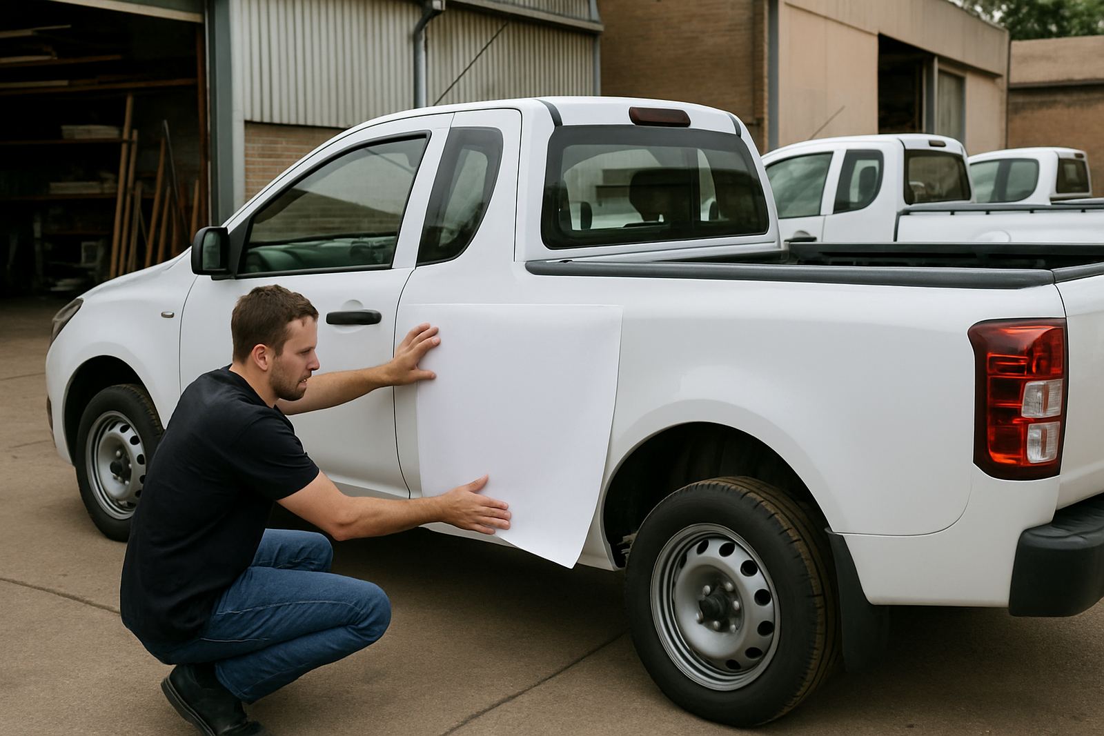
We measured each area on site and checked the wall condition before proceeding. In places where paint finish varied slightly, we adjusted panel sizes and used a print layout that allowed for neat alignment. That avoided gaps and helped the work sit properly on the walls, not fight against them.
Door numbering and notice panels that stay readable
The core of the job was a door numbering system for bedrooms and shared rooms. We supplied printed and cut numbering elements with strong contrast, sized for quick reading from the passage. The numbers were applied in a consistent position from door to door so students and staff could follow the sequence without second-guessing.
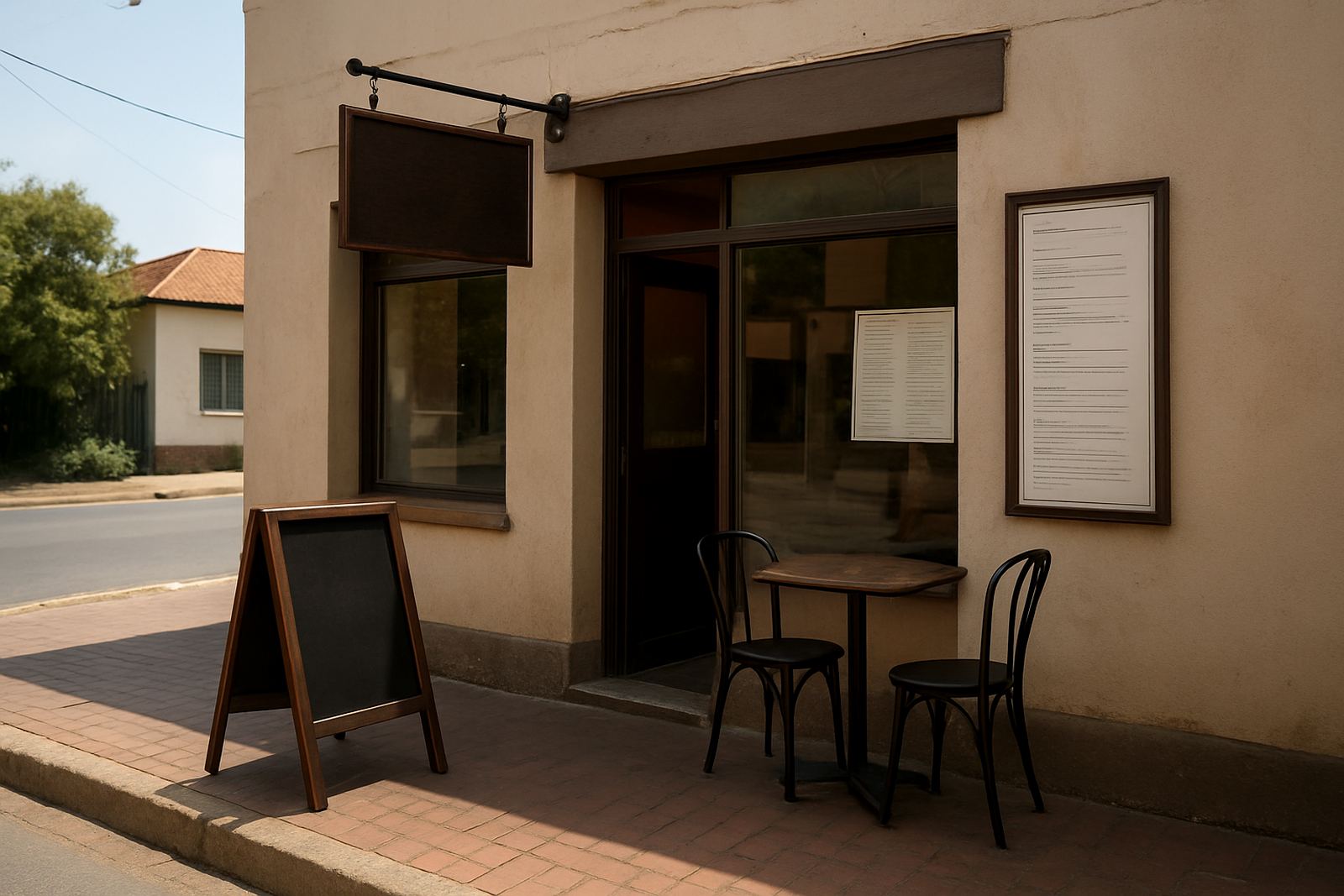
For communal information points, we installed notice panels that could carry residence rules, maintenance notices and event updates. The panels were made to suit everyday use, with smooth faces that are easy to wipe down and a layout that leaves room for changeable content. In a student setting, that matters more than people think because notices change often and the panel needs to look orderly even after a few swaps.
What we supplied and installed included:
- Door number graphics for rooms and key access points
- Custom notice panels for common areas and circulation spaces
- Wall graphics for shared lounges and passage sections
- Printed directional elements to support wayfinding
- Surface preparation where required for better adhesion
Communal wall graphics with a calm, clean finish
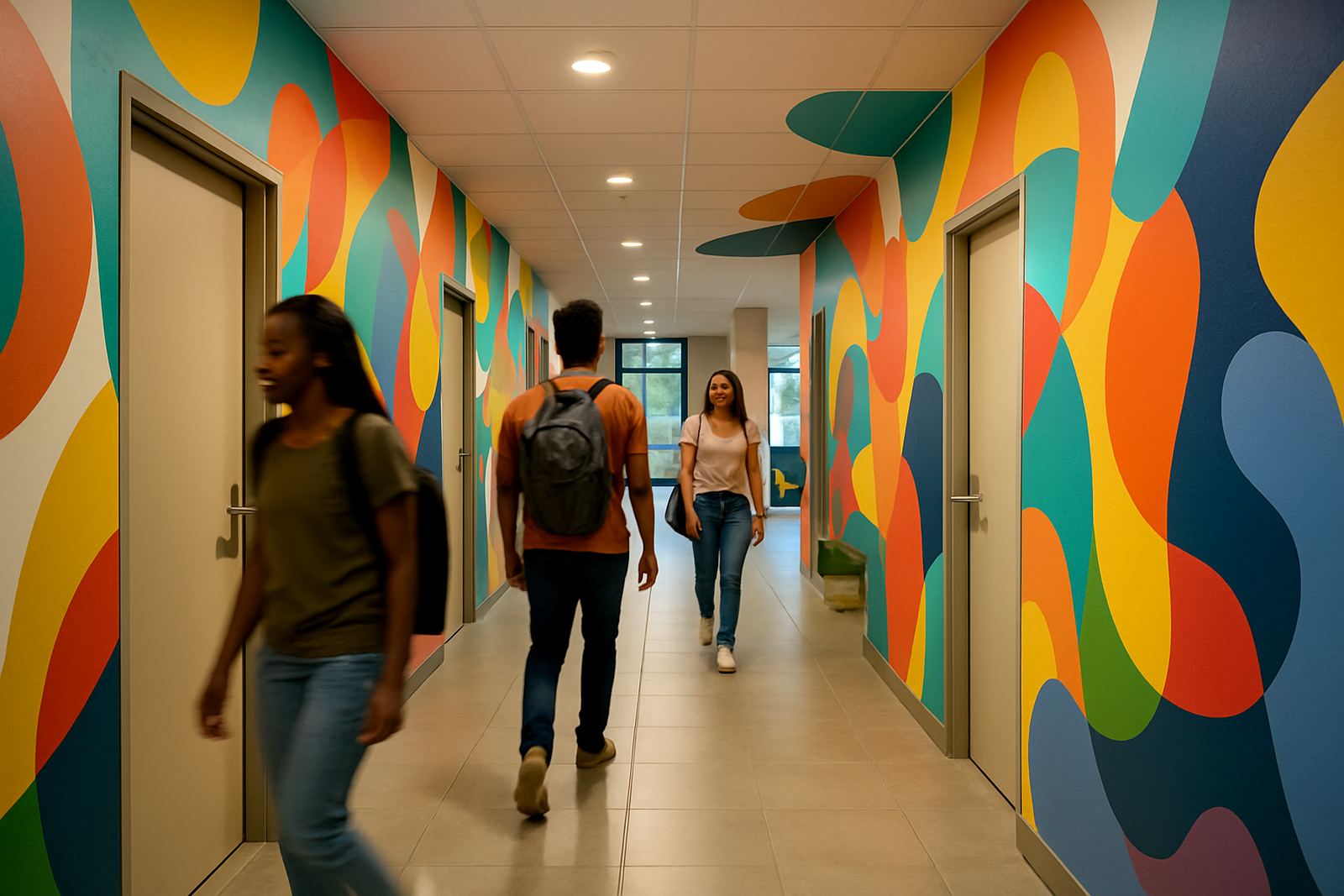
The wall graphics were intended to lift the shared spaces, not overrun them. We used a layout that added identity to the residence while keeping the tone calm and practical. In a student environment, too much visual noise can become tiring. The better approach is clear imagery, measured spacing and a finish that looks intentional from a distance and close up.
We worked with the residence’s preferred content and prepared the artwork for print production. Some elements needed minor artwork setup to improve spacing and line weight, and a few items were redrawn for cleaner reproduction. That is especially useful when the artwork has to be scaled for walls, doors and panels all in one project. A graphic that looks fine on screen can fall apart when it is enlarged unless the line work is set up properly.
The communal pieces were installed in sections to keep the passages usable and reduce disruption to residents. Installation was planned around quieter times of day, and our team kept the work area tidy. There was some shifting around of furniture and notice points during the process, but we kept the sequence controlled so each area could be completed and checked before moving on.
Timeline, production and installation in three weeks
The project ran over three weeks from site check to final installation. Week one covered the survey, measurements and artwork setup. Week two was production, including print, cutting, finishing and panel preparation. Week three was installation, alignment checks and final touch-ups.
That timing worked well for a residence environment because it allowed us to complete the main graphics work without dragging it across several occupancy cycles. It also gave us time to check each piece before application. In accommodation work, a rushed install can leave a crooked number or a panel that does not sit right against the wall, and those small details show immediately.
For this job, our internal team roles were straightforward:
- Zanele Dlamini handled graphic design and layout preparation
- Lerato Molefe coordinated production scheduling and finishing
- Thabo Ncgobo managed fabrication and component prep
- Johan Smit led the on-site installation
- Annelie Botha coordinated client communication and approvals
- Kagiso Moeketsi assisted where any fitted graphic sections were needed
Results for residents, staff and maintenance teams
The finished result gave the residence clearer room identification and better visual order in the common spaces. Students could find rooms more easily, staff had better notice areas for updates, and the wall graphics helped the building feel maintained rather than temporary. That is often the real benefit of a project like this: it is not just decoration, it helps people move through the space with less friction.
The number system also made follow-up work simpler for cleaning and maintenance teams. When labels are consistent and easy to read, there is less back-and-forth when a room needs attention or a notice has to be updated. That saves time over the long run, especially in larger accommodation blocks.
If we were doing the same kind of project again, we would keep the same approach: survey first, simplify the layout, and use materials chosen for repeated contact and easy cleaning. For residences in Bloemfontein, Mangaung or surrounding towns, that practical sequence tends to give the best result. It is not flashy, but it lasts, and that is what matters in shared housing.
What Central Signs would repeat on the next residence job
We would repeat the same planning steps on the next student accommodation project, because the process proved sound. Start with on-site measurements, confirm the numbering sequence, test the notice board layout and make sure the wall graphics suit the actual wall sizes, not just the drawing. That is the part that saves time later.
We would also keep using materials that are suited to indoor circulation areas, where cleaning and daily contact are constant. The residence setting is specific, and the work has to answer to that. If the graphics hold up to a full term of student traffic, they are doing the job properly.
For accommodation managers in Bloemfontein and the wider Free State, this kind of project is a good example of what practical signage can do. It helps people find their way, improves the look of the building and reduces confusion without needing constant attention.
Key facts
| Project type | Student accommodation graphics |
|---|---|
| Town | Universitas, Bloemfontein |
| Work included | Door numbering, notice panels, communal wall graphics |
| Timeline | 3 weeks from survey to installation |
| Main materials | Printed and cut indoor graphic media with durable finish |
| Use areas | Bedrooms, passages, common rooms and notice points |