
Start with one message, not a long list
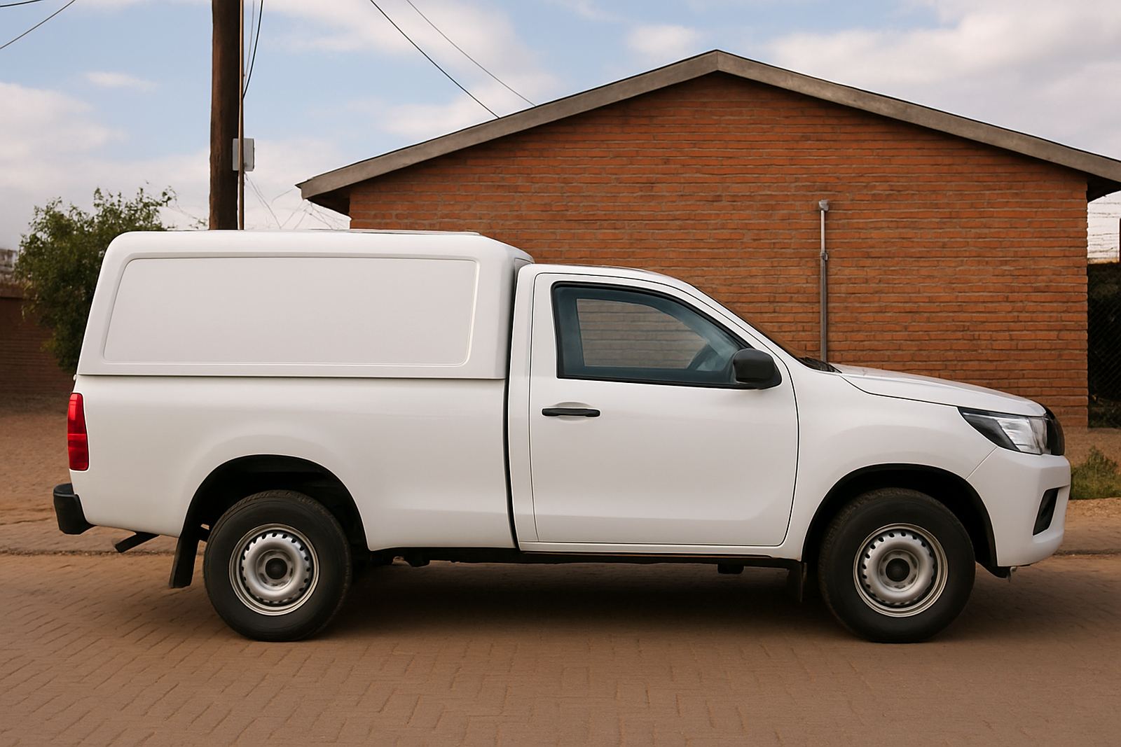
A compact bakkie needs a simple message. When too many services, phone numbers and slogans get pushed onto one door panel, the branding becomes hard to read and the vehicle starts looking untidy. A driver in traffic should be able to catch the business name in two seconds or less.
For most small work vehicles, the strongest layout is company name, what you do, and one clean contact point. If the bakkie is often parked at residential jobs in Mangaung or school pickups in Bloemfontein, the branding should still look professional without feeling busy.
- Use one main brand name in the largest text
- Keep the service line short, such as plumbing, electrical or maintenance
- Leave breathing space around logos and wording
- Place contact details where they are visible but not crowded
Choose colours that stay legible in Free State light
Bright Free State sun can flatten pale colours, especially on white or silver bakkies. Dark text on a light body panel usually holds up better, and strong contrast helps when the vehicle is moving. If the bakkie spends time on dusty sites, in Welkom or around Kroonstad, avoid colour combinations that disappear once dirt starts building up.
Glossy finishes can look smart, but reflectivity matters too. A lot of work vehicles sit outside during load-shedding and in open yards, so the graphics must still be clear in shade, strong sunlight, and early evening. On a small bakkie less is often better than trying to cover every panel.
- Dark lettering on pale bodywork is usually easiest to read
- Use only two or three brand colours on compact panels
- Make sure phone numbers and wording do not blend into the vehicle colour
- Ask how the design will look after a month of dust and weather
Use doors and tailgate first, then decide on extras
The doors and tailgate are the highest value areas on a small bakkie because they are seen from the side, behind and at loading points. Those surfaces should carry the main information. Bonnet, canopy sides and rear quarter panels can help, but only if they support the main message instead of fighting it.
A good local example is a service bakkie working between Bloemfontein, Botshabelo and Thaba Nchu. If it is used for callouts, the side doors can carry the business name and service line, while the tailgate carries the contact details. That keeps the vehicle clean-looking and still useful when parked at a client's gate or shop front.
For fleet consistency, it helps to repeat the same layout across every compact vehicle, even if the panel sizes differ a little. That way people recognise the business faster on the road.
Keep the wording tight and practical
Small bakkies usually do not have room for long taglines or a full list of services. The wording has to be plain and direct. A customer should know what you do without having to stand next to the vehicle. Short text also ages better, because you are less likely to need a rebrand when services change a bit over time.
Where space is tight, one strong service description is better than six small ones. If the business offers general maintenance, repairs or installations, say that clearly and leave the detail for the enquiry form or quote process.
- Use simple nouns and active wording
- Avoid stacked lines that are hard to read from a distance
- Do not crowd the number plate area or legal markings
- Keep the font style clean, not decorative
Plan for installation, maintenance and removals
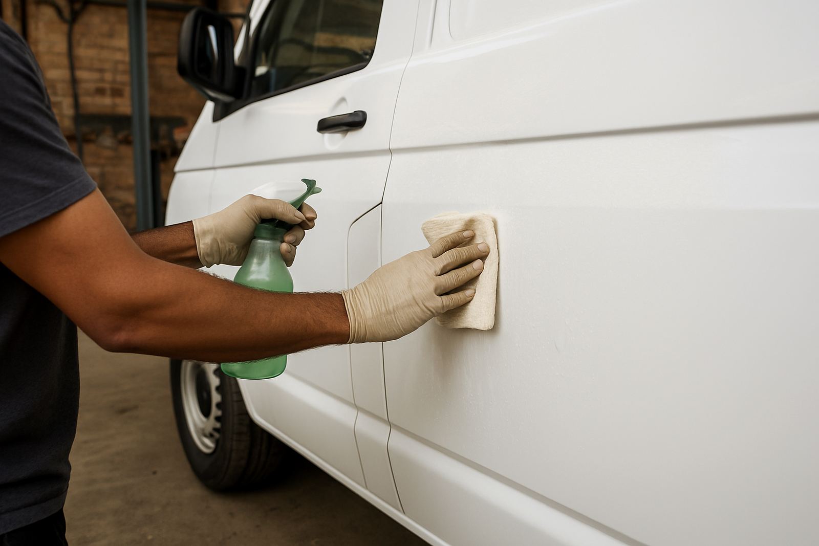
Small bakkies often work hard, so the graphics need to handle washing, sun and repeated loading. Good application matters as much as the design. Edges must be sealed properly and the finish should suit the way the vehicle is used, whether it is parked outdoors in Hamilton or running between sites all day.
If the bakkie is leased or due for resale, it is worth planning the branding so it can be removed cleanly later. Debranding is easier when the vinyl was applied properly in the first place. The same goes for sign refurbishment on older vehicles where the wording is still fine but the finish has faded.
Maintenance visits can also help where there are small lifts, scratches or peeling corners. A quick fix now is cheaper than replacing an entire side panel later.
What Central Signs looks at before branding a small bakkie
For compact vehicles, the best result usually comes from a proper site survey or at least a clear set of vehicle photos and measurements. Our team checks panel size, body colour, window positions, handles, rub strips and any existing decals before artwork is set up. That makes it easier to keep the layout tidy and practical.
We also consider how the bakkie is used. A delivery vehicle, a service truck, or a contractor's runaround all need different emphasis. Some need high visibility for roadside parking, while others need a quieter look for clients visiting offices and homes across Mangaung, Brandfort, Winburg and nearby areas.
- Artwork setup matched to actual vehicle dimensions
- Logo redraws where the original file is too small or blurry
- Vinyl cutting and print production for doors, tailgates and canopies
- Graphic lamination for extra protection against sun and washing
- Vehicle application by installers who know how to work around curves and seams
Clear branding works harder than crowded branding
A small bakkie does not need to shout to be noticed. It needs to be easy to read, quick to remember and neat when it pulls up at a client's property. That is the real difference between clutter and proper branding. When the layout is planned well, the vehicle does marketing work every day without getting in the way of the job.
For businesses in Bloemfontein and surrounding towns, that often means fewer words, stronger contrast and better placement. It is a practical approach, not a flashy one, and it usually gives the cleanest result on the road.