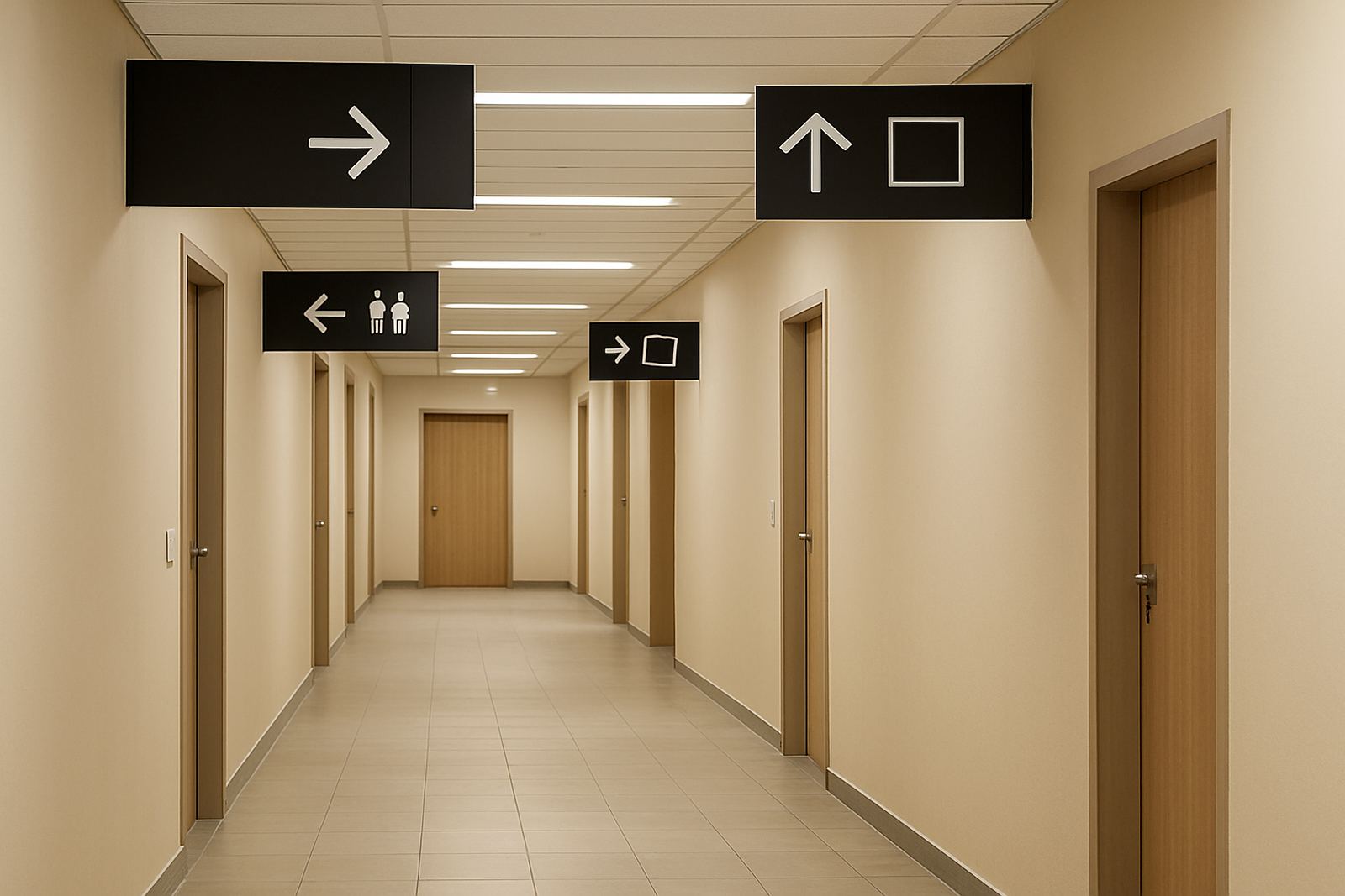
Why people trust a place that is easy to read
A visitor usually notices confusion before they notice style. If a building has clear signs from the parking area to the front door, then through reception, corridors and service areas, people feel confident and move at the right pace. That matters in Bloemfontein where offices, clinics, schools, warehouses and retail sites often share the same property, and visitors may arrive in a hurry after a long drive from Mangaung, Botshabelo or even Kroonstad.
Good wayfinding is not about using more signs. It is about placing the right sign in the right place with the right wording. A simple arrow, a room name and a clear colour code can do more than a long paragraph ever will. The aim is to reduce hesitation, not add more reading.
- Use short words that people recognise at once.
- Keep sign sizes in proportion to viewing distance.
- Repeat important directions at decision points, not everywhere.
- Match indoor and outdoor signs so the route feels consistent.
Start at the first decision point, not the front door
Many businesses think wayfinding begins at reception, but the first decision often happens at the gate, parking bay or pedestrian entrance. If visitors cannot tell where to park, where to enter, or which door is public, they start the visit unsure. In summer rain or strong Free State sun, a person standing outside will not spend long searching for clues.
The best system begins with the journey a visitor actually takes. Start from the street, then work through parking, entrance, waiting area, corridors, stairs, lifts, ablutions and exits. At each point, ask what someone sees while standing still. If the answer is not obvious, the sign needs better wording or better positioning.
- Mark visitor parking clearly, including disabled bays where required.
- Use entrance signs that are visible from the approach path.
- Place directional signs before the turn, not after it.
- Keep emergency exits separate from general directions.
Readability beats decoration every time
A sign can look attractive and still fail at its job. For wayfinding, the main test is legibility from the distance and angle where people will actually stand. Large letters, enough contrast between text and background, and simple icons all help. Glossy finishes may catch too much light in a bright foyer, while a matte finish often reads better near windows and under downlights.
In a busy building, people are usually carrying bags, talking on the phone, or watching for traffic. They do not have time to study fancy wording. A good sign gives one instruction at a time. If you need a second sentence to explain it, the message is probably too crowded.
- Use high contrast such as dark text on a light field or the reverse.
- Choose plain typefaces that stay readable at a glance.
- Limit each sign to one action, like reception, exit, stairs or toilets.
- Test the message from standing height and from a moving car if it is outdoor signage.
Materials matter in Bloemfontein weather and traffic
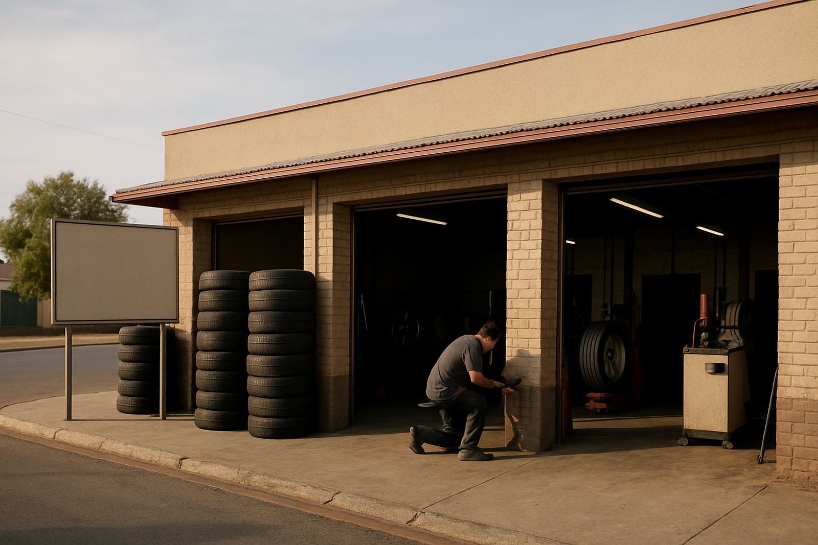
Wayfinding signs have to survive sun, dust, winter cold and the occasional knock from trolleys or bags. In Bloemfontein and the surrounding areas, outdoor signs need solid mounting, clean edges and print that will not fade too quickly. Indoor signs still need to handle dust, cleaning products and regular touch points, especially in schools, clinics and public-facing offices.
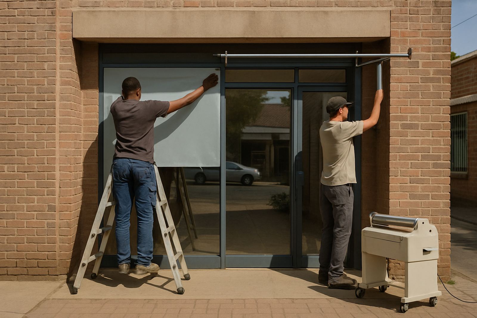
For exterior routes, we often recommend rigid panels, cut vinyl, applied graphics and protective lamination where the surface calls for it. For floors, doors and walls, the finish must suit the surface and the traffic level. A sign near an entrance is one thing; a sign in a corridor used by dozens of people an hour is another, so the material choice should match the wear and tear.
- Use weather-ready materials for outdoor directional signs.
- Apply laminate where the print needs extra protection.
- Choose slip-aware floor graphics for temporary events or exhibitions.
- Allow for maintenance visits if routes change often.
Make the route work for visitors, staff and suppliers
A good wayfinding plan does not only help customers. It also helps staff move faster, helps suppliers find loading areas, and helps contractors avoid private zones. At a warehouse or industrial site in Hamilton or on the edge of Mangaung, a well marked route can cut down on phone calls and missed turns. That saves time and reduces confusion at the gate.
Internal signs should reflect how the site really operates, not how it looks on paper. If visitors must sign in first, say so. If deliveries use a side entrance, make that route obvious. If certain doors are staff-only, say it plainly. A site with clear rules feels better managed, and people are less likely to wander where they should not be. That is especially useful in places with restricted access or after-hours security needs.
- Separate visitor, staff and delivery routes where possible.
- Use consistent wording across all signs on the property.
- Label levels, rooms and departments in the same format.
- Update signs after a layout change or tenant change.
A simple Bloemfontein example that makes the point
Think of a mid-size office block in Bloemfontein with a public entrance, a basement parking area and several tenants on two floors. Without clear wayfinding, visitors arrive at reception unsure whether to use the stairs or the lift, and suppliers ask security for directions every morning. With a proper sign plan, the route becomes simple: street sign, parking sign, entrance sign, floor directory, tenant markers and room identifiers. The whole place feels calmer.
For Central Signs, good wayfinding starts with a site survey and continues through artwork setup, vinyl cutting, sign fabrication and installation. Sometimes the job also needs logo redraws, debranding of old tenant signs, or maintenance visits after a renovation. The aim is not to crowd the building with labels, but to help people move with confidence. That is what makes a space easier to use, and easier to trust.
If a visitor can get from the gate to the right door without stopping twice, the signs are doing their work properly. Simple really, but not always simple to plan.