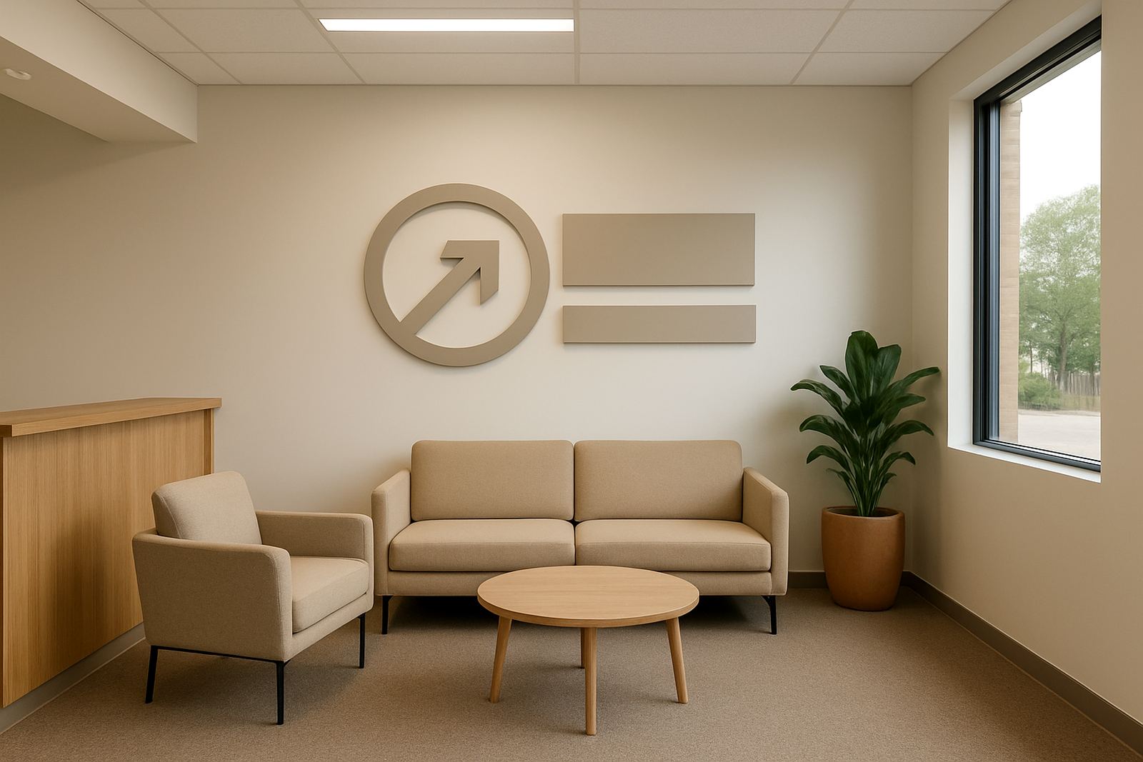
Start with the wall behind the first greeting
The most useful branding move in a reception is usually the simplest one, the wall behind the front counter or seating area. A clean logo wall gives visitors an immediate point of focus and makes the space feel intentional instead of temporary. In Bloemfontein offices, clinics and service businesses, this often works best with cut letters, flat panels or a printed feature panel mounted where the eye naturally lands.
Keep the artwork clear and readable from a few metres away. If the wall is large and the room has pale paint, a darker logo treatment often works well. If the reception is already busy with furniture or brochure racks, keep the branding restrained and let one strong element do the talking.
Use window graphics to control privacy and add identity
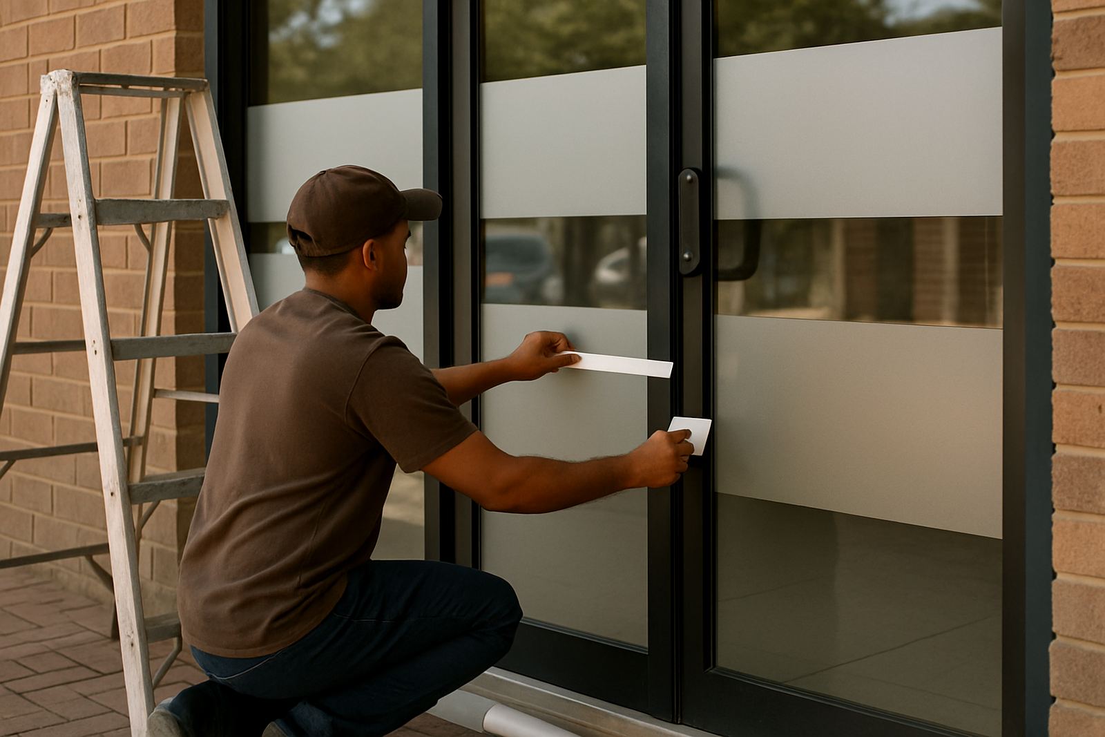
Reception windows are valuable space. Frosted vinyl, printed film or cut frosted shapes can give privacy without shutting out daylight. That matters in offices with direct sun, especially on the hotter side of the building, because glare can make waiting areas uncomfortable and fade light materials over time.
- Frosted bands for privacy at seated eye level
- Cut logos on glass doors for a neat entrance
- Directional decals for reception, accounts or visitors
- Full or partial print graphics for a stronger visual statement
In towns like Mangaung and Botshabelo, where many businesses work with mixed public access and private office space, window graphics can help separate areas without building extra walls. They also tidy up older glass fronts that need a better finish.
Make floors and doors work harder for wayfinding
Reception branding should do more than look good. It should help people move with confidence. Floor markings, door decals and directional labels reduce confusion for first-time visitors, couriers and suppliers. This is especially useful in shared buildings where several businesses operate from the same entrance.
A floor graphic can point guests toward a waiting area or sign in point, while door lettering can distinguish meeting rooms, staff access and public areas. For safety and maintenance, the material choice matters too. Low-slip finishes and proper lamination help the graphics handle foot traffic, cleaning and the dust that builds up in busy Free State premises.
- Arrow decals for visitor movement
- Numbered room labels for easier navigation
- Anti-slip floor graphics for high traffic spots
- Door names that match your office layout
Choose finishes that suit Bloemfontein conditions
Reception signs should suit the building and the local conditions, not just the logo. In Bloemfontein and surrounding areas, dry air, dust and strong sunlight can affect how long a finish stays neat. In some spaces, fluorescent light can also make colours look flat, so a good print setup and proper lamination are worth the effort.
For a more premium feel, use materials that sit flat and cleanly against the surface. For a practical office, go for finishes that are easy to wipe down. If the reception gets heavy foot traffic, nearby doors slam often or the aircon runs all day, fixings and adhesives need to be chosen with that in mind. A sign that looks good on day one but lifts at the edges quickly becomes a maintenance issue.
Add brand cues through small details, not just one big sign
Many reception areas feel incomplete because only one part of the branding was considered. The wall logo may be in place, but the counter front, glass panels and notices still look unrelated. A stronger result comes from repeating the same colours, type style and shapes in a few well chosen places.
Good small details include printed counter panels, name plates, directional labels and branded notice boards. Even a simple strip of vinyl on a plain wall can tie the space together. In a reception that needs to handle walk in clients, delivery drop offs and internal staff movement, these smaller touches make the room feel organised without overloading it.
- Counter branding that matches the main wall sign
- Simple notice boards with company colours
- Branded hours or visitor instructions at eye level
- Matching labels on doors, glass and folders
Plan for cleaning, repairs and future changes
Reception branding should be practical to maintain. If a company updates its logo, changes its office layout or moves departments around, the signs should be easy to refresh. That is why removable decals, modular panels and well planned installation points matter. They save time later and reduce the cost of a full replacement.
Businesses in Welkom, Kroonstad and smaller Free State towns often need signage that can be maintained without closing the office for a day. A proper site survey helps with this. It shows where the light falls, what the wall surface is like and which areas get bumped by chairs, trolleys or visitors. From there, the right mix of fabrication, print production and installation can be planned. It’s a small thing, but it makes a big difference when the reception has to stay open and neat.