
Why Colour Does More Than Look Good
On a sign, colour is not just decoration. It tells people where to look first, what to remember later, and whether your business feels easy to find. In Bloemfontein, where drivers move from bright sun into shade from trees, buildings and forecourts, a weak colour combination can disappear in seconds.
Good colour choices improve legibility, but they also support brand recognition. If your shopfront, delivery bakkie and wall sign all use the same main colours, people start linking that look to your business. That matters whether you are on a busy street in Hamilton, near a school in Mangaung, or on a service route into Botshabelo.
The aim is not to use the most colourful option. The aim is to use colours that still read clearly from a distance, in daylight, in low light and after a few years of dust and weather.
Contrast Is What Makes Letters Readable
Contrast is the difference between the letters and the background. High contrast means the message is easy to read quickly. Low contrast means people have to slow down, and most won't. That is why black on white works so well, and why pale grey on silver often struggles.
For roadside signs, the rule is simple: if the letters blend into the backing board, the sign is working against you. In strong Free State sunlight, colours can wash out more than people expect. Deep blue on white usually reads well. Yellow on white does not. Red can work well on white or black, but red on dark brown may be hard to catch at a glance.
A practical test is to step back to the viewing distance you expect in real life. If it is a shop sign, stand where a pedestrian or driver would first see it. If it is a vehicle graphic, look at it from 10 to 20 metres away. If the message takes effort, the colours need another look.
- Dark text on a light ground usually reads best in daytime.
- Light text on a dark ground can work well for night visibility.
- Busy backgrounds need stronger letter colours or a solid panel behind the words.
- Thin typefaces need more contrast than bold ones.
Choosing Colours for Shops, Vehicles and Windows
Different sign surfaces need different colour thinking. A wall sign has more space, so you can use fewer colours and keep the layout clean. A vehicle graphic has curves, handles and panels to work around, so the colour needs to stay clear even when cut into smaller sections. Window graphics may need enough transparency to allow some light through, while still protecting privacy or carrying a promotion.
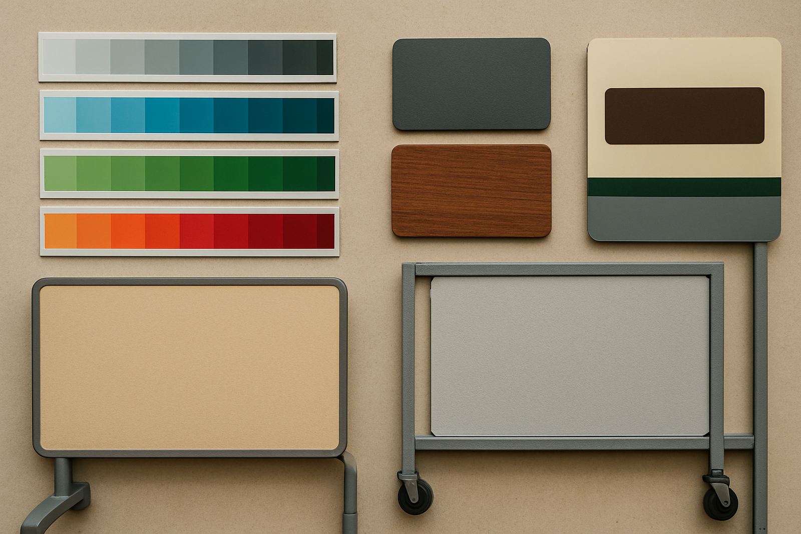
For shopfronts in Bloemfontein and Welkom, many owners choose a strong main colour with one clear accent. That keeps the sign tidy and makes it easier to match across other items like labels, decals and exhibition panels. For bakkies and vans serving Kroonstad, Thaba Nchu or Brandfort, high contrast usually works best because the vehicle is seen in motion.
It also helps to think about how the colour behaves on different materials. A colour that looks bright on a computer screen may appear duller once printed, laminated or applied to a textured surface. Matte finishes reduce glare, while gloss can make colours pop more but may reflect too much sun at certain angles. Choosing the right finish is part of the job, not an afterthought.
How Local Light and Weather Change the Result
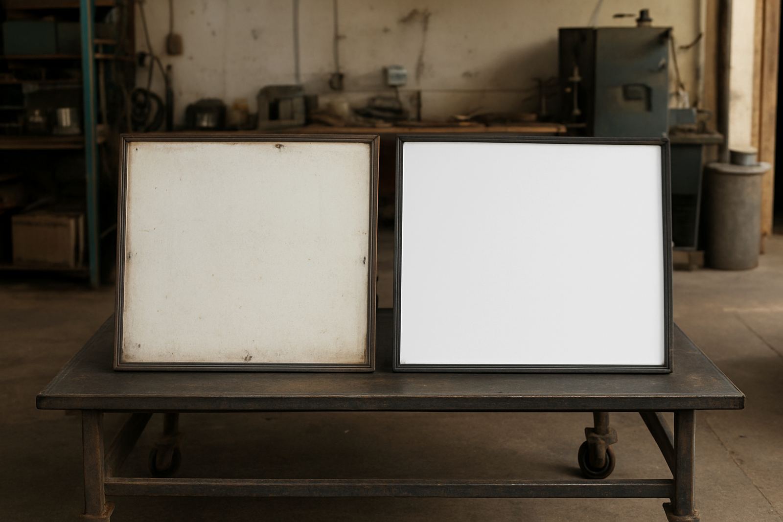
Bloemfontein has hard sunlight, dry air and dusty days, and that changes how colours perform. Pale colours can look good at first, but dust can make them look tired faster. Dark colours hold their tone well, though they can fade in direct sun if the material and ink are not suited to outdoor use. Coastal humidity is not the main issue here, but heat, wind and UV still matter a great deal.
On a north-facing sign, colour choice can make a real difference to long term readability. A bright yellow panel may seem bold on day one, yet after months of exposure it can lose punch if it is not protected. For businesses that need regular maintenance visits, we often look at whether the current colours are still doing their job or whether a simple refurbishment will save the structure and improve visibility.
One local example: a service business in Mangaung had a dark maroon sign with charcoal lettering. It looked neat indoors, but outside it was difficult to read at speed, especially in late afternoon glare. Changing the lettering to white and adding a cleaner border improved recognition straight away, and the owner said customers started finding the entrance more easily.
Brand Recognition Starts With Repeat Colour Use
When people see the same colour combination again and again, they remember it faster. That is why colour consistency matters across shop signs, vehicle graphics, labels and exhibition displays. Even a small mismatch can weaken the effect. If the wall sign is one shade of blue and the van is another, the public gets mixed signals.
Central Signs helps businesses keep colour use consistent across different items and materials. That can include logo redraws, artwork setup, print production, vinyl cutting, lamination and sign fabrication. It can also include debbranding when old graphics need to come off cleanly before a new colour scheme goes up.
- Use one main colour family and one support colour for most items.
- Keep the same logo colour on signage and vehicle application.
- Match floor, wall and window graphics where customers move through the same space.
- Choose colours that still work if the sign is viewed quickly, from a distance, or in poor light.
When to Refresh a Sign Instead of Replacing It
Not every worn sign needs to be rebuilt from scratch. Sometimes the colour is the main problem, not the frame or panel. If the structure is still sound, a sign refurbishment can bring it back into line with the business image and make the message clearer. That can be useful for older premises, changing tenants, or a company that has updated its look but kept the same location.
Signs that have faded unevenly, cracked at the edges or lost their contrast should be checked before they become a problem. A quick site survey can show whether the face needs replacement, whether the backing can stay, or whether a new finish will improve the result. For businesses in Botshabelo, Thaba Nchu and surrounding areas, this is often a practical way to manage cost while improving appearance.
Well chosen colours do more than decorate a building. They help people recognise you, trust what they see and remember where to return. That is the real value of colour on signs, and it is worth getting right the first time.